Looking to improve your website’s performance? An impactful landing page could be the key to achieving your goals.
These carefully designed landing pages capture the attention of your visitors and guide them towards the desired action, thus being able to multiply your conversion rate by two or three. By highlighting your offer in a clear and persuasive way, with key elements such as a clearly visible call to action, you optimize your chances of converting.
In this article, we present concrete examples of effective landing pages and the techniques to perfect yours. You’ll discover how simple adjustments can have a huge impact on your results, incorporating the key elements which make the difference between an ordinary page and a real conversion machine.
What is a landing page?
A landing page is a dedicated web page crafted to turn visitors into customers by focusing on a single objective. Whether it’s encouraging a purchase or signing up for a newsletter, its sole purpose is to drive a specific action. With a streamlined design and engaging content, it removes distractions and provides a clear path forward. Its success lies in its simplicity and persuasive messaging, ensuring visitors stay focused on the goal.
The following are essential components of a successful landing page:
- A catchy title
- Clearly presented benefits
- A visible call to action
- Customer testimonials
- A limited time offer
Landing pages convert better than traditional pages, because they make it possible to precisely measure the return on investment of marketing campaigns.
For advice: Test different versions of your landing page to optimize its effectiveness. Compare conversion rates and continually adjust your approach.
How to create a landing page?
Creating an effective landing page requires thought and strategy. Start by clearly defining the goal of your page. What do you want visitors to do? Select a landing page template based on your objective. Many online tools offer customizable templates.
The header is crucial. Create a catchy headline and relevant image to capture attention in seconds. The content must be concise and impactful, highlighting the key benefits of your offer. Use bulleted lists to make reading easier.
Don’t forget the call to action (CTA), which must be visible and encouraging. To optimize your landing page, test different versions and analyze the results to adjust accordingly.
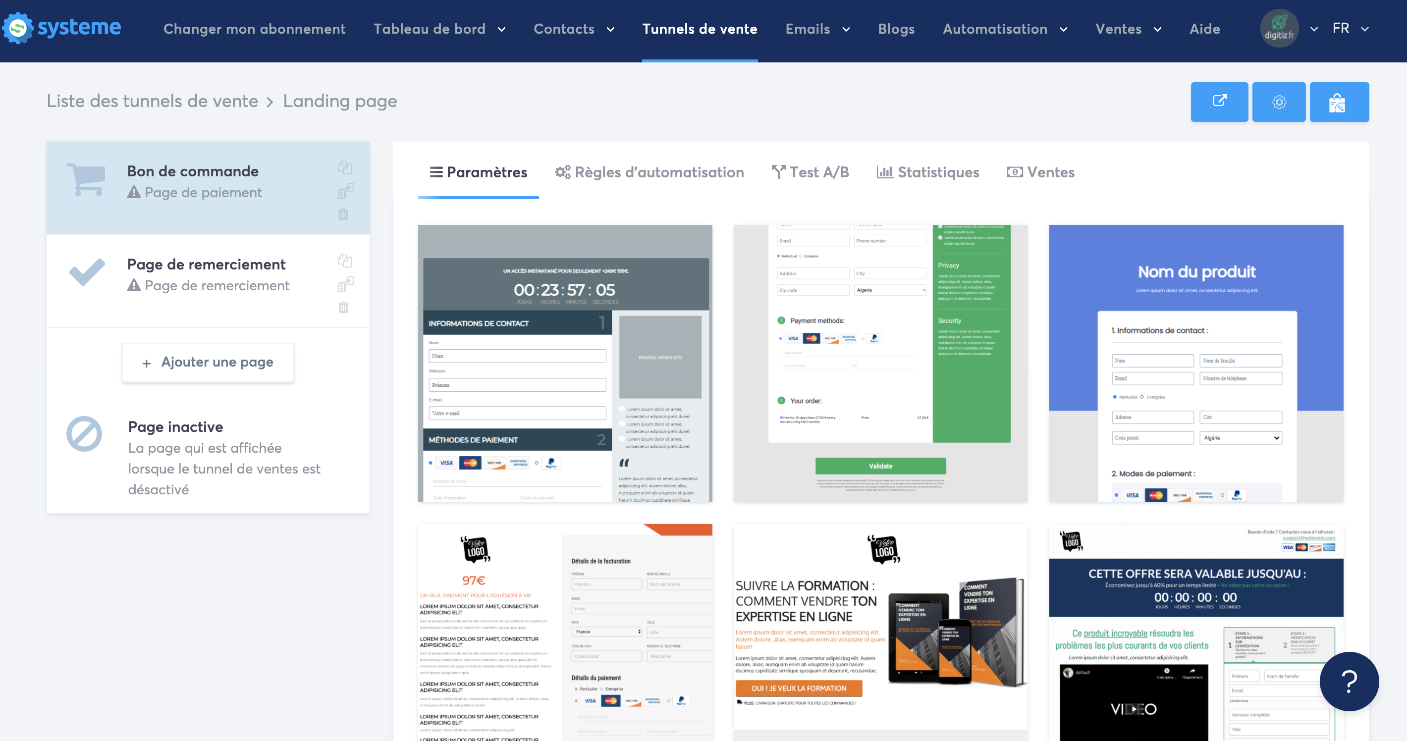
Today, the solution that stands out is System.io. This is a complete French tool for creating landing pages with the implementation of sales funnels.
I also carried out a comparison on the landing page creation software if you are still hesitant about which solution to choose.
Examples of landing pages
Landing pages play a crucial role in converting visitors into customers. Here are some effective types, each with their own characteristics and purposes.
The classic language page
Generally simple in its layout, the classic landing page is the most basic and common form you can find. It is designed so that Internet users can access the offer in just one click. Normally, the information provided about the product or service is summarized to encourage users to subscribe directly on the site.
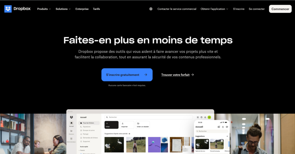
1. Drop box
This minimalist landing page is devilishly effective. The offer is clear, the promise is explicit, and the clean design is pleasant.

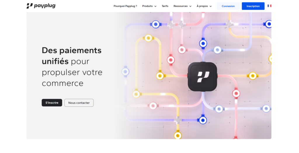
2. PayPlug
With an excellent design, this page highlights the registration form with a smart contrast to the background image. Here, the registration form is cleverly highlighted by the contrast of the background photo.

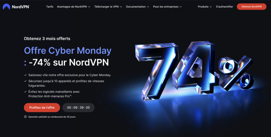
3. NordVPN
This NordVPN landing page is effective because it combines an attractive offer highlighted by a premium blue 3D design. The message is reinforced by clear arguments. Urgency is created by the counter and the mention of Cyber Monday, while the red CTAs naturally guide towards conversion. The simple navigation and the streamlined structure make it easier to understand the offer.

4. Count
Zendesk’s registration page has all the elements of a successful landing page: a simple promise, a nice visual, a simple form and reassurance elements at the bottom


The splash page
Unlike the rest of the pages where the user lands on the page after clicking on an ad, users see a splash page when you have a specific objective to complete. A landing page of this type includes very little text, a background image and the message you want to convey. The main purpose of a splash page is to inform visitors about something, such as a new offer.
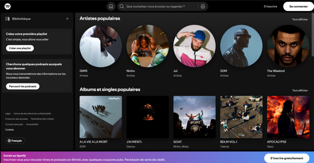
5. Spotify
When promoting new features or special events, Spotify often uses attractive splash pages. These pages feature captivating visuals and clear messaging to encourage users to sign up or take advantage of a limited offer, like a free trial of their premium service

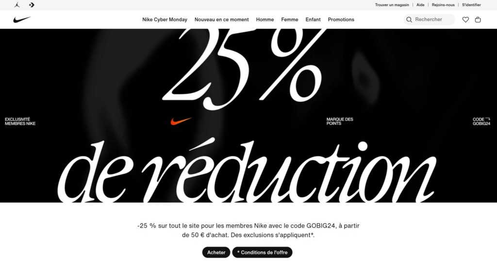
6.Nike
Nike creates splash pages to announce product launches or sporting events. For example, when launching a new pair of shoes, the splash page displays a striking image of the product with a powerful message and a call-to-action button to purchase or learn more.

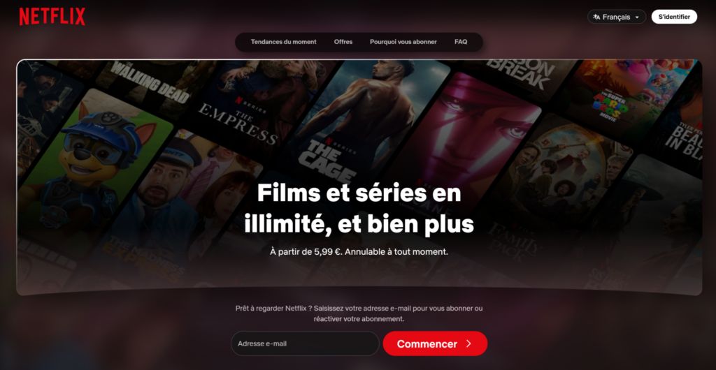
7. Netflix
When they launch a new series or movie, Netflix uses splash pages to attract users’ attention. These pages feature eye-catching visuals related to the content, accompanied by a message encouraging visitors to watch the new title or subscribe for access to their entire catalog.

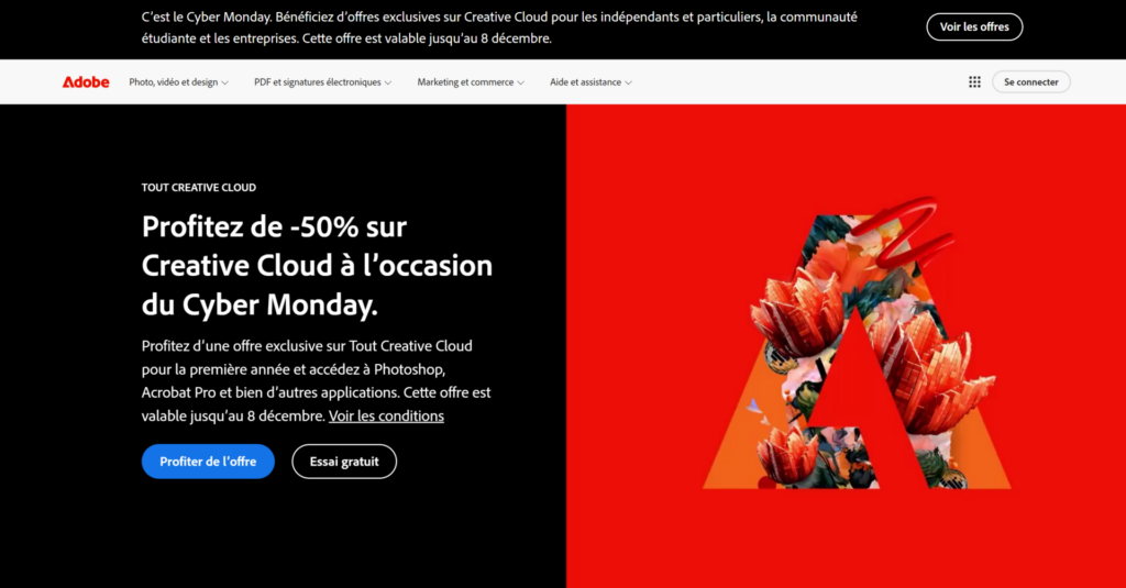
8. Adobe
Adobe often uses splash pages to promote its new offerings or product updates. For example, when launching new software, a minimalist splash page presents the tool with an attractive visual and a clear message to encourage visitors to learn more or register.

The product landing page
This type of landing page typically lists everything you might need to know about a specific product or service and allows you to sign up for a trial, request a quote or demo. These landing pages are a quick and easy way to inform visitors of all offer descriptions at a glance. As you can see in the examples below, it is advisable to integrate the subscription form during this crucial step for the visitor to maximize your conversion rate.
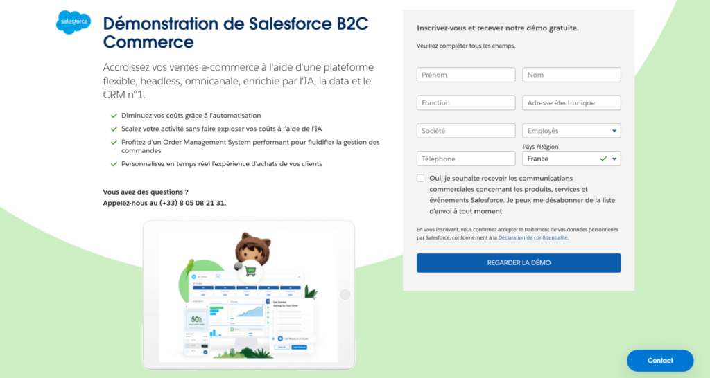
9. Sales force
The Salesforce landing page illustrates many best practices. The CRM tool offers a sufficiently detailed landing page with plenty of information and many elements to give the user confidence. However, we can blame the form for being a little too cumbersome to complete.

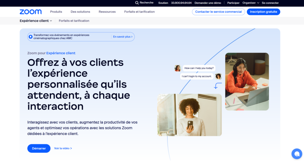
10. Zoom
Zoom’s landing page for its video conferencing platform highlights essential features, such as video quality and screen sharing features. It features testimonials from businesses using Zoom, as well as a clear button to register or download the app, making the registration process simple and engaging.

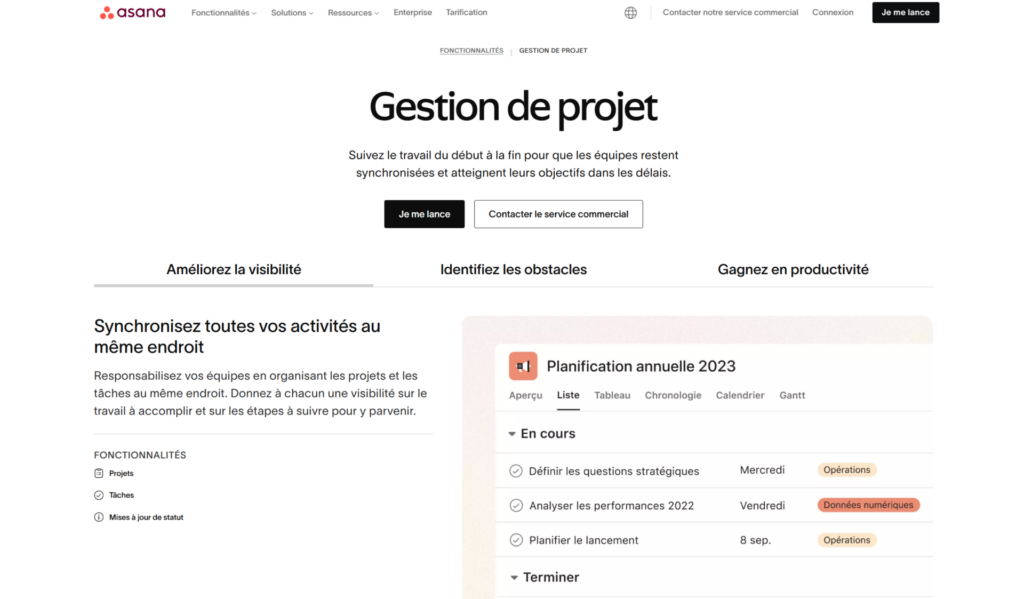
11. Asanas
Asana’s landing page presents its project management tool by highlighting its key features, such as task management and team collaboration. It includes visuals of the interface, testimonials from satisfied users, and a call-to-action button to sign up for a free trial, making it easier for visitors to convert.

The lead capture landing page
Often called Squeeze pages, these landing pages allow you to capture leads directly by collecting your visitors’ personal data. These capture pages generally have no exit path either through links or a navigation menu and only contain a form. Premium type content white paper is usually offered in exchange for your visitors’ personal data. This is the way to build your contact list for your prospect database and then do lead development or marketing automation.
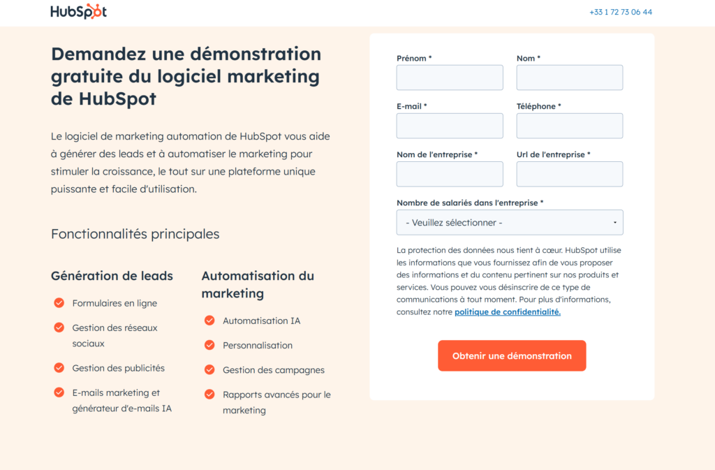
12. HubSpot
HubSpot offers a landing page to download a free guide to digital marketing. This page is designed to capture leads, with a simple form only asking for name and email address in exchange for the download. Key points from the guide are also summarized to show the value of the offering.

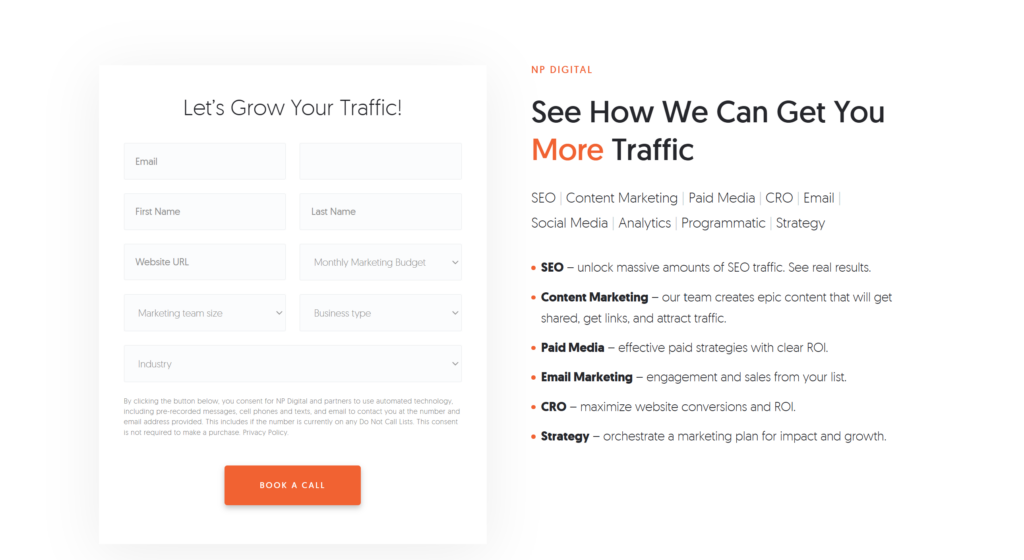
13. Neil Patel / NP Digital
Neil Patel / NP Digital has a dedicated landing page with a lead generation form. It specifically targets visitors wanting to delegate their SEO efforts to an agency.

14. Crazy Egg
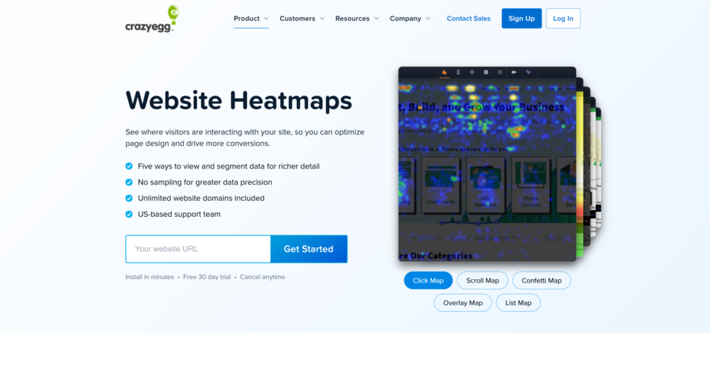
Crazy Egg offers a landing page to download a guide on conversion optimization. It includes a minimalist lead capture form where visitors can enter their email address to receive the guide. The page presents key points about what the guide contains, reinforcing user interest.

15. Aimable.dev
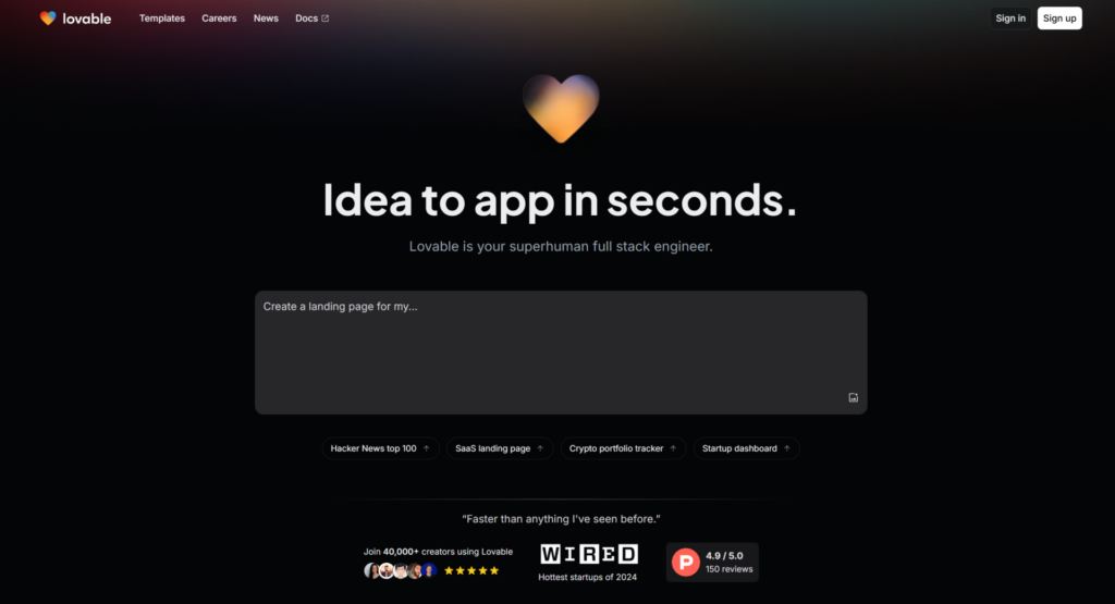
Aimable.dev offers a landing page focused on their product’s features, immediately capturing visitors’ attention. This encourages them to create an account and quickly subscribe to their services.

There are of course other examples that deserve to be shown here. However, by respecting good practices and drawing inspiration from landing pages that already work, there is no doubt that you will be able to increase your income. To improve your conversion rateit is important to remember that your landing pages must be constantly tested with methods ofA/B testing to obtain the best results.
If you have other examples of landing pages, don’t hesitate to share them in the comments!

